
7 Key Elements of a Great eCommerce Marketing Email

Ecommerce emails are a powerful form of communication brimming with possibilities for interaction.
From irresistible subject lines or tempting preview texts, to decisive calls-to-action, or even modest footers, every little detail of an email holds importance.
In this article, we will break down these crucial parts of an email in eCommerce marketing. The goal? To offer you clear-cut steps that will make your own marketing emails much more effective and engaging.
We won't just tell, we will show you how. You will see for yourself how each section of an email comes to life in actual examples, all backed up with solid data.
So let’s start with the first thing your recipients see: a subject line.
A Compelling Subject Line
Did you know that the subject line of your email can make or break whether it gets read?
It is true—64% of email recipients decide whether to open an email just by glancing at its subject line.
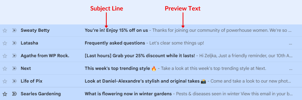
Let's back this up with some real-life examples.
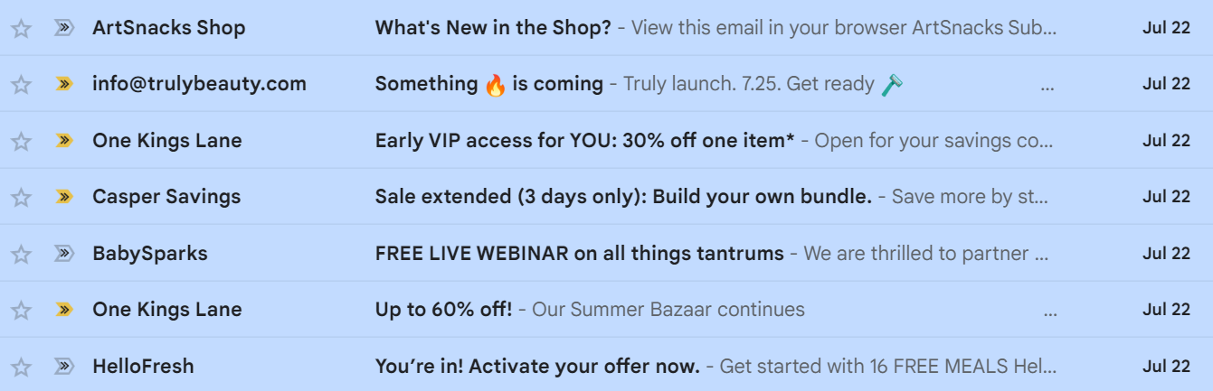
Source: Private Inbox
As you can see in the image, all subject lines are different.
However, at a glance, you get a sense of what to expect—is it a welcome email, a new product announcement, seasonal sales, or a webinar invitation?
As subscribers quickly scan their inboxes, they will choose which one of these emails they will open based on those subject lines.
The enticing ones will likely be opened, while the dull ones risk being ignored or, worse, trashed.
Considering that 74% of Americans subscribe to 1–10 newsletters, their inboxes are jam-packed with emails. That means your subject line has mere seconds to grab their attention, and that you should make every word count.
So, how can you give your subject lines a much-needed edge?
Start with the basics—inject some action words and create a sense of urgency.
For instance, take a look at the subject line from the online children’s store Little Whimsy:
"SALE ON SALE! Last chance to nab these before they’re gone FOREVER!"
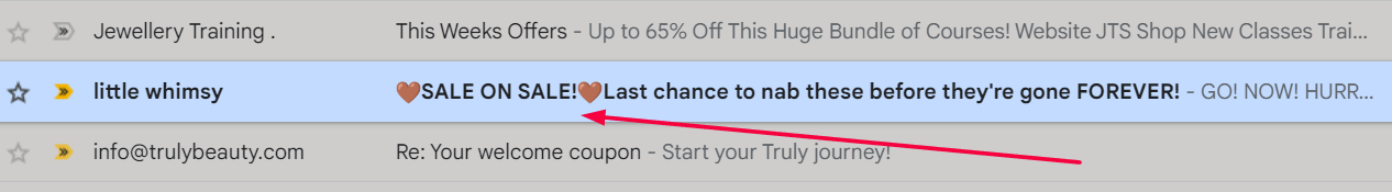
Source: Private Inbox/Little Whimsy
The subject line doesn’t just grab the reader’s attention but it also activates their fear of missing out, thus motivating subscribers to open the email.
Another smart way to make your subject lines more clickable is by sparking curiosity.
Given that we humans are curious by nature, how about giving a sneak peek at what your email contains?
For example, when promoting a new product, try a subject line like "Spoiler Alert! Ink Collection Product Reveal," similar to what ArtSnacks did in the example below.
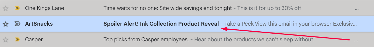
Source: Private Inbox/ArtSnacks
This will lure your subscribers to click open.
Beyond being compelling, your subject lines should also be crisp and cogent because long ones tend to get lost in the shuffle.
Aim for a sweet spot under 50 characters and focus on capturing the essence of your email in a handful of carefully chosen words.
Need inspiration? Check out One Kings Lane's subject line: "Surprise! One More Day to Save!"
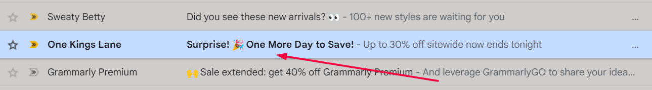
Source: Private Inbox/One Kings Lane
It not only communicates the email's message in a few well-chosen words but also prompts action.
So, the next time you are penning an email, give some extra thought to your subject line.
It is the little details that make a big difference in whether your email enjoys the limelight or languishes unnoticed.
Well-Planned Preview Text
Nailing a subject line may nudge subscribers to open your emails. But even the most compelling subject lines may not always be enough to seal the deal.
That is where the preview text comes in. This brief snippet of text nestled just beside the subject line can be a game-changer when it comes to ramping up your email open rates.
Still foggy on the concept of preview text? Here is an image to help you understand it better.
Source: Private Inbox/Flashy
Now, you might be wondering what happens if you don't pay attention to your preview text.
Well, email service providers will swoop in and automatically generate it for you using the first text line in your email content.
The results are often lackluster, unable to impress or interest subscribers. Even worse, it can give the impression that you are either clueless about email marketing or just too indifferent to bother crafting a decent preview text.
Therefore, your preview text should provide a glimpse into what the email is about while also being persuasive.
Think of it as an extension of your subject line—if the subject line is a hook, your preview text is what reels them in.
When crafting preview text, try including numbers. Let’s say your email peddles a sale. Your preview text could tease, "Up to 65% Off."
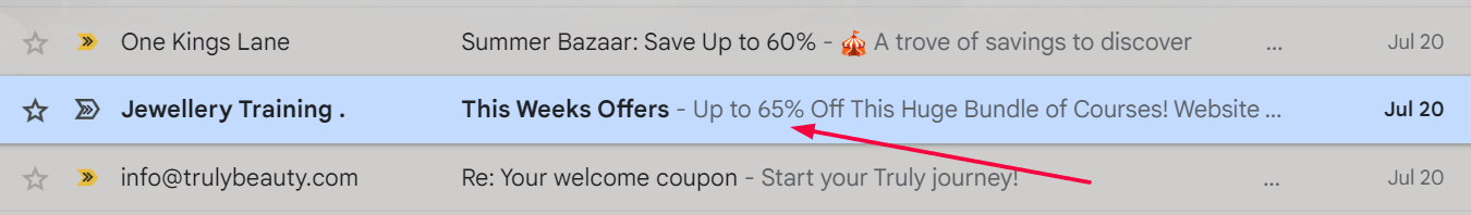
Source: Private Inbox/Jewellery Training Solutions
Creating urgency while tickling your subscribers' curiosity provides a smart way to motivate them to take action.
Now that you are armed with the preview text basics, let's say a word or two about length.
With limited space available, aim for a text 50–130 characters long. Many readers are on mobile devices, so the shorter, the better.
To sum up, compelling subject lines might catch your subscriber's eye, but only when they are combined with well-crafted preview text are you going to win the click.
Attention-Grabbing Headings
You might be an expert at crafting snazzy subject lines and preview texts.
Still, none of that will matter if the heading of your email isn't captivating enough to persuade subscribers to continue reading the second they open the email.
Most readers skim through content rather than reading every word.
Therefore, effective headings help those who skim grasp the gist and navigate according to topics they find most relevant.
Think of them as mini-billboards inside your email, each showcasing a key point or idea.
Let's now explore, using a few examples, how you can make your headings pop.
Since headings are naturally brief, every word should deliver impact and meaning. For instance, check out this email from Truly Beauty, a vegan skincare brand.
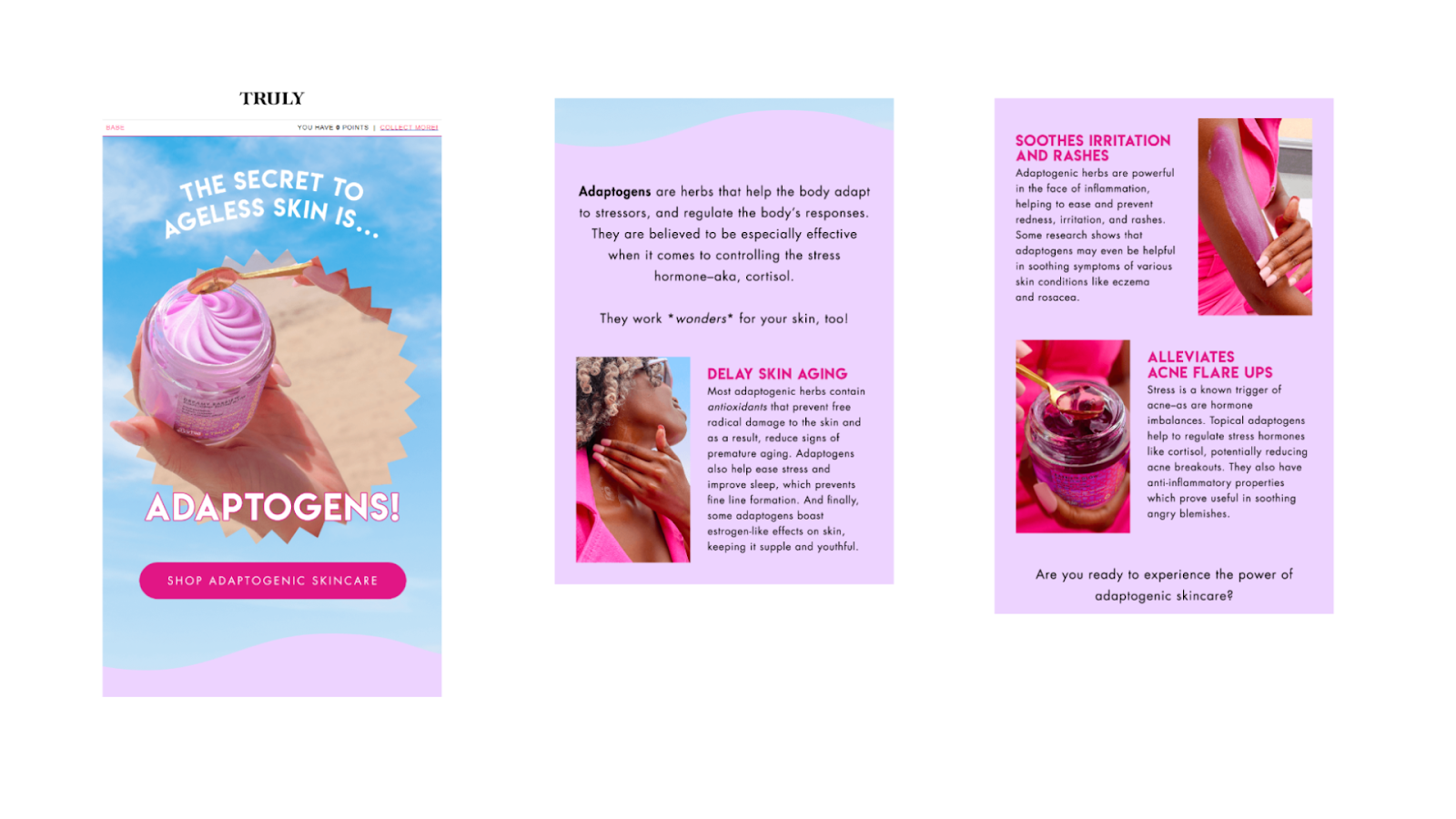
Source: Private Inbox/Truly Beauty
Notice how their headings highlight the perks of adaptogenic skincare? It is clear, crisp, and the reader can swiftly glean the newsletter's purpose by scanning through the headings.
Moreover, you can also add a pinch of spice to your emails.
For instance, stirring curiosity with romantic, dreamy headings can transport your readers, just like Papier's example.
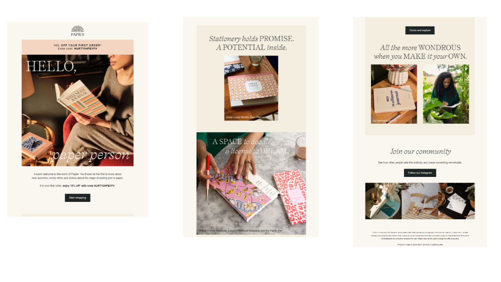
Source: Private Inbox/Papier
This online e-commerce brand that sells personalized stationery excels at using headings that emphasize the magical charm of stationery. This way, they sell an experience, not merely products.
Every now and then, stop your readers in their tracks with a surprising or amusing heading. It breathes freshness into your email and catches the reader's attention.
Casper, the mattress brand, has this tactic down pat.
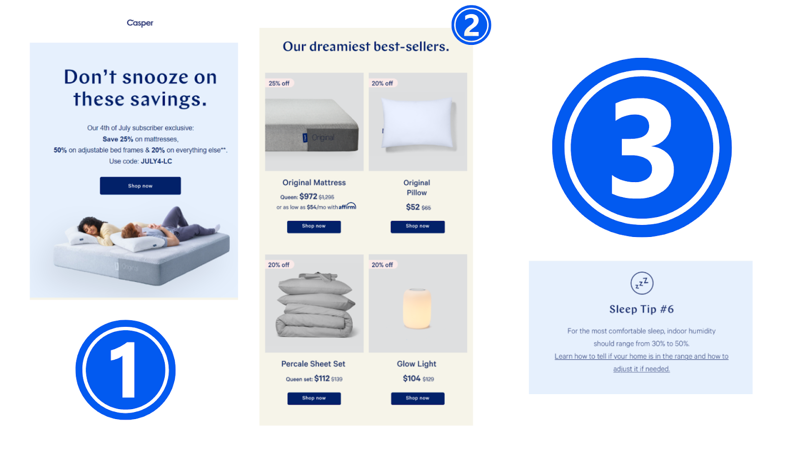
Source: Private Inbox/Casper
Their newsletters are brimming with word plays and humor that entice the reader to want to explore more.
As you can see, this isn't just about writing catchy headings.
It is about making words carry weight, weaving a little excitement into your copy, and occasionally folding in a surprise that keeps your reader guessing.
Concise Copy
Did you know that even goldfish can outpace the average adult's attention span? That means adults are typically able to focus on one task only for approximately eight seconds.
It is not that adults aren’t capable of paying attention. It is simply that people are busy and thus impatient.
Your audience is likely hustling between responsibilities and doesn't have the time (or the desire) to wade through lengthy, convoluted emails.
So it is up to you to ensure that your emails are snappy, to the point, and easily digestible.
Let's explore how packing a punch with fewer words can make all the difference.
Compare the following two examples:
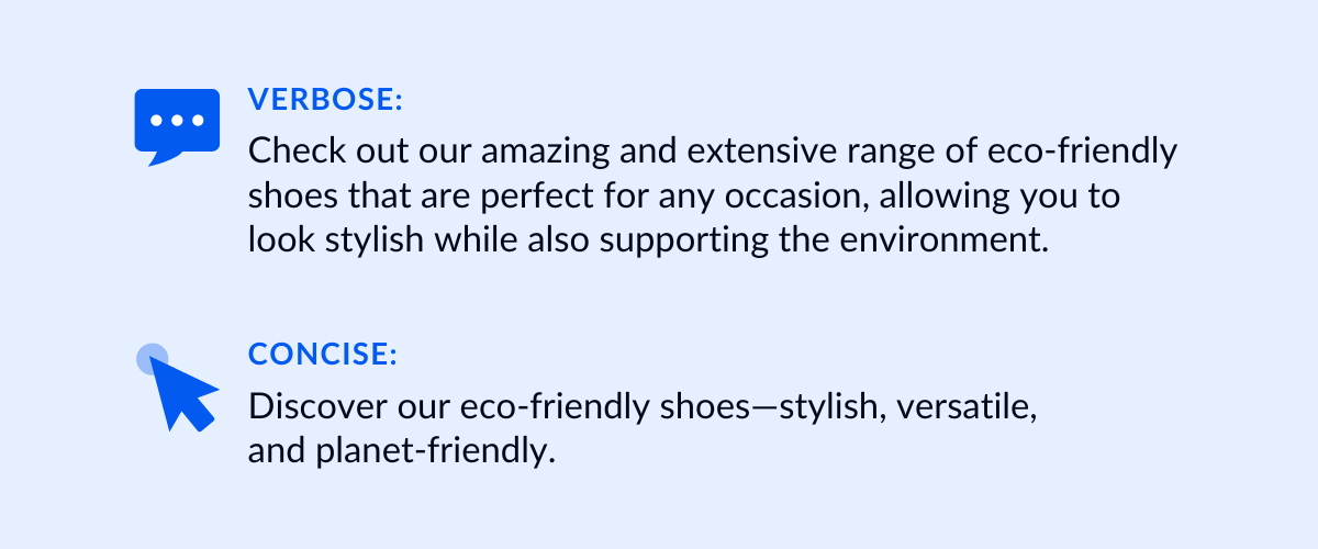
Source: Flashy
See how the concise version grabs attention without overwhelming the reader. Quite an improvement, wouldn't you agree?
Moreover, by keeping your content short and sweet, you send a clear message: you value your audience's time.
Let's examine two more examples:
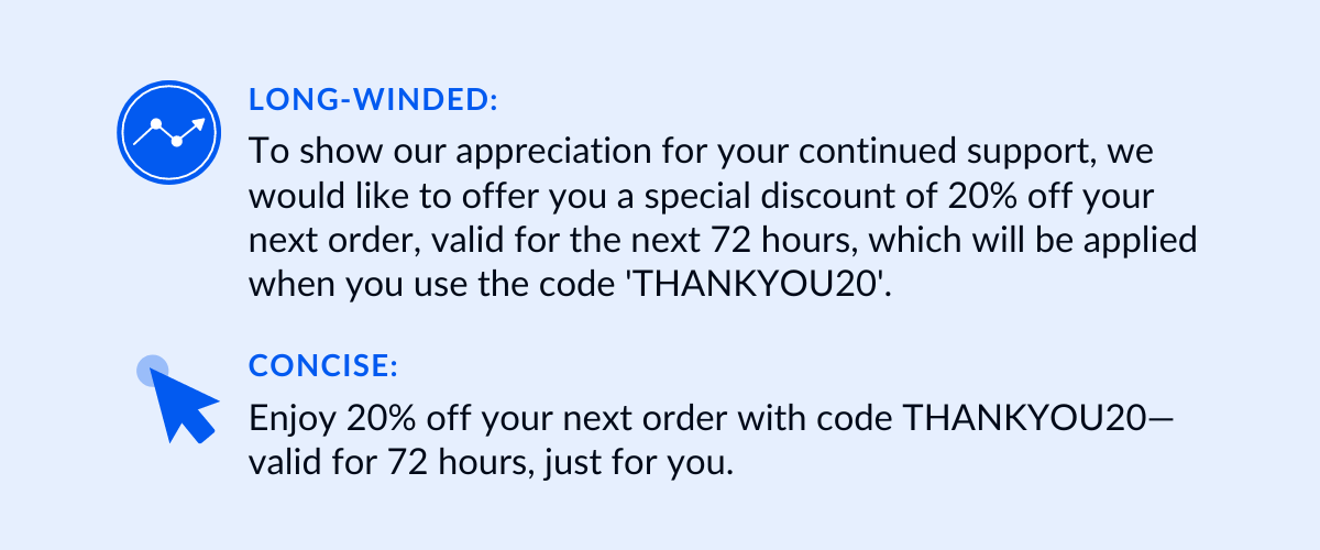
Source: Flashy
Notice the difference? The concise version is friendlier, more efficient, and far more likely to lead to clicks and conversions.
Additionally, a succinct, focused message can work wonders when directing subscribers toward a call to action:
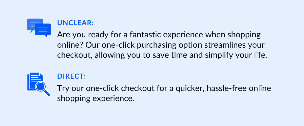
Source: Flashy
The second version simplifies the call to action, making it more likely to resonate with subscribers.
These examples show us that implementing concise copy in your eCommerce emails doesn't mean you have to sacrifice the soul of your content.
Quite the opposite, it is about understanding that simplicity is key.
Your audience is juggling work, family, and personal commitments. The last thing they want to do is meander through a lengthy email.
Instead, they need valuable information at a glance. So, concise emails are more likely to leave an impression on the subscribers and drive the desired actions.
Visually Appealing Imagery
Have you ever been going through your email inbox, only to find yourself pausing to admire the stunning visuals of a particular email?
If you are nodding right now, you just witnessed firsthand the power of visually appealing imagery in eCommerce emails.
In essence, show-stopping visuals do more than just please the eyes, they also etch a lasting impression.
As laid out in "Brain Rules" by John Medina, people recall 65% of the information they heard three days prior when it is paired with an image, compared to a mere 10% when it is solo text.
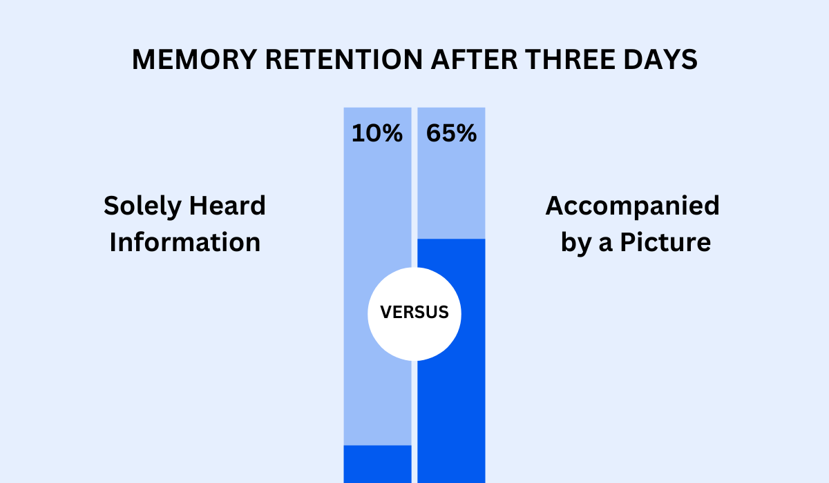
Illustration: Flashy / Data from Brain Rules
That is why putting an emphasis on visually stunning elements in eCommerce emails is a must.
Let's now discover a few practical ways to choose them wisely.
The golden rule at play here is to make sure your images are in sync with your brand's visual identity, including colors, fonts, and style. When your visuals are singing the same tune as your branding, it creates recognition and a cohesive experience.
To illustrate, look at the email from Pepetools, a provider of jewelers' tools, below.
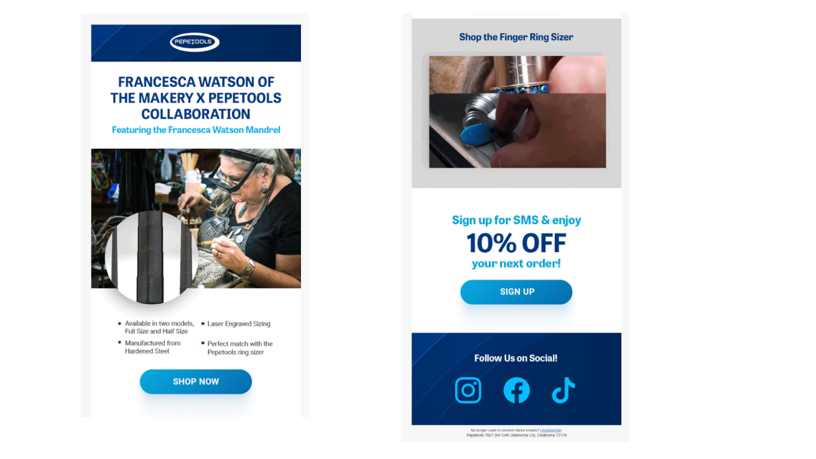
Source: Private Inbox/Pepetools
Notice how the brand’s distinctive blue color echoes through the whole mail, creating an unmistakable link with the top-placed logo?
That is precisely the sort of brand recognition you want the reader to experience when they open your email.
Next, when it comes to the quality of your email imagery, there is no room for compromise.
No one is interested in seeing a grainy or pixelated display. Stick to high-resolution images to make sure your content looks top-notch.
Heard the saying “Less is more?"
Never has it been more relevant than here. Avoid cluttering your email with a surplus of images. Choose those that complement your message without stealing the thunder from your written content.
The newsletter from Sweaty Betty, a reputed activewear brand for women, is a good example of this.
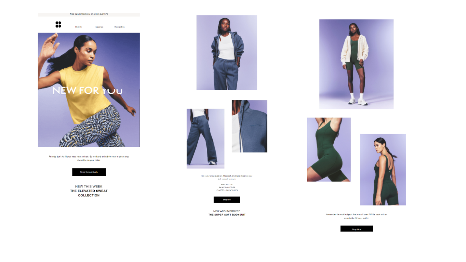
Source: Sweaty Betty
Although, at first glance, it might seem loaded with images, on closer look, you will notice that they are merely different views of the same outfit.
This way, a subscriber can better see how the clothes look on a real person, and you get a sleek email that is not cluttered.
Now, you might be thinking, creating visually appealing emails sounds like a tough cookie to crack.
However, quality marketing platforms today, including our own tool, Flashy, come with templates designed to simplify this task.
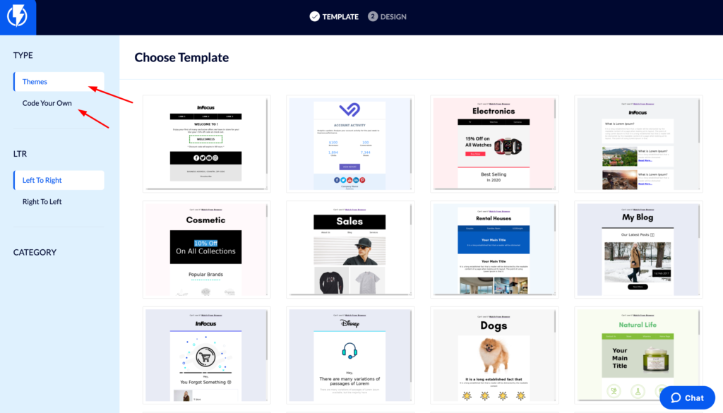
Source: Flashy
As you can see in the image, all you need to do is pick a layout, drop in your images, and you will get a beautifully designed email.
Visually appealing emails aren’t just about aesthetics, but also about delivering lasting impressions.
Therefore, don't hold back on investing your attention in imagery.
Clear Calls to Action
Imagine this: you just opened an email from your most-loved online brand offering a tempting discount.
The deal sounds great, and you are keen to snag that bargain, but you find yourself stumped. Where exactly should you click to start shopping?
Quite likely, that email missed delivering a clear call to action (CTA). And a missed CTA is a missed opportunity for the brand in terms of valuable conversions.
Whether it is making a purchase on your eCommerce store or reading a post in the blog section, a CTA should tell the subscribers exactly what they should do next.
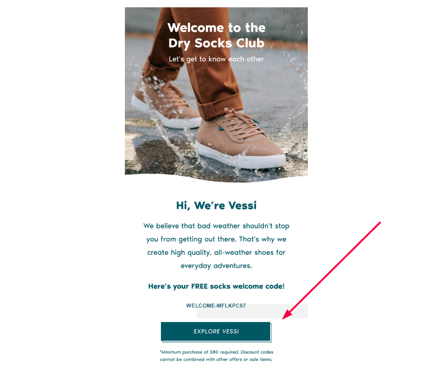
Source: Private Inbox/Vessi
When it comes to what kind of CTAs yield the best results, the tip of the scale is always on the side of the ones that are on point.
Subscribers are more likely to click on a CTA that speaks to them in a direct, easy-to-understand manner.
Therefore, use simple terms like "Shop now", "Learn more", or "Sign up" because they not only tend to be CTR top performers but also clearly state what should be the next action.
Plus, by being straightforward, you are less likely to lose your reader halfway through the email because they can't discern the desired outcome.
You might wonder about the best way to present CTAs—buttons, links, or plain text. Interestingly, button-based CTAs have been found to amplify click-through rates by a whopping 127%.
So, keep this handy data nugget in mind as you design your next standout call to action.
Remember, CTAs are your gentle nudgers, subtly guiding your subscribers toward making a decision.
To best serve your audience, ensure your CTAs eliminate any guesswork about what you want them to do.
An Informative Footer
Often overlooked, the humble footer plays a surprisingly important role in eCommerce emails.
Far from being just a meager space to fill, it has the potential to be a treasure trove of essential links, fine print, and extra information.
So, let’s see why and how it is important.
Before anything else, the footer is a place where you have to play by the rules.
Email marketing laws such as the US CAN-SPAM Act dictate what your email footer should carry–your physical address and an unsubscribe link.
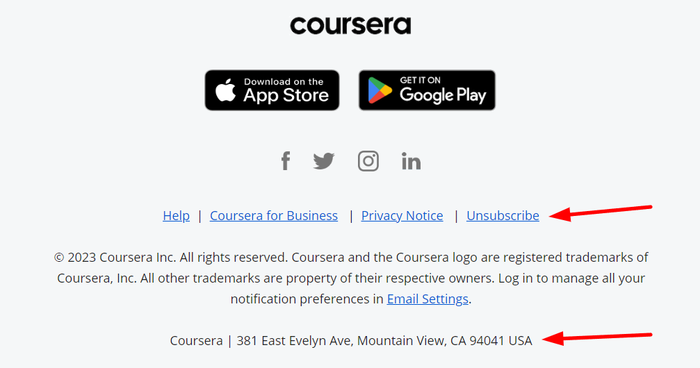
Source: Private Inbox/Coursera
Similarly, legislation in the UK and Europe also requires you to make it easy for your recipients to unsubscribe from your emails.
Once you have ticked the legal boxes, what you put in your email footer depends entirely on you.
For starters, you can use your footer as an extension of your brand identity. If you weave in your logo, brand typefaces, and color scheme, you can add an extra layer of visual connection between your website, marketing materials, and emails.
Take Alaska Airlines, for example.
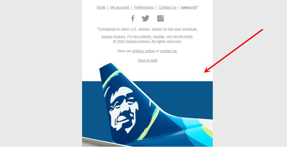
Source: Private Inbox/Alaska Airlines
They incorporate their recognizable aircraft tail design in their footer, reinforcing their brand identity.
Moreover, many footers score brownie points by including social media links.
Freepik, a popular platform for graphic resources, is a good example of this.
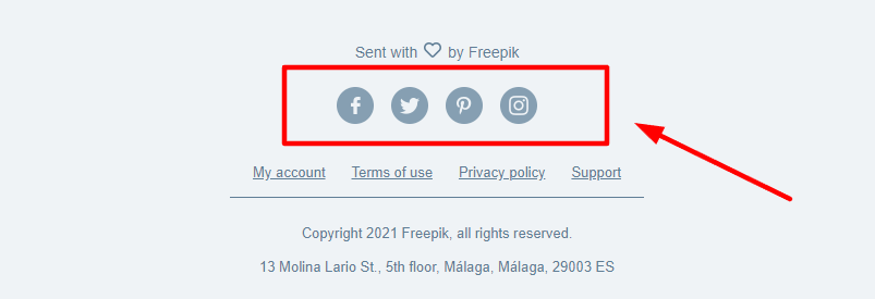
Source: Private Inbox/Freepik
Adding links to your social media links is a straightforward yet effective way to direct your email subscribers to your other online channels.
As a result, you have more platforms to build relationships with your customers and promote your offers.
Additionally, you can use your email footer to highlight your company’s values.
Check out how Patagonia, a popular outdoor brand, connects with nature-loving customers by detailing their commitment to planet conservation.
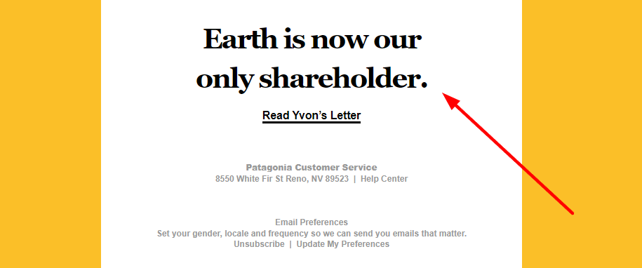
Source: Private Inbox/Patagonia
Patagonia also includes a link to the letter from their founder and owner, Yvon Chouinard, where their dedication to minimizing global warming and ecological destruction is explained further.
The footer can also help you foster a positive relationship with your subscribers by letting them be in control of their subscriptions.
That is why it is wise to include easy access to subscription preferences, just like Taylor Stitch, a high-quality men’s clothing brand, does.
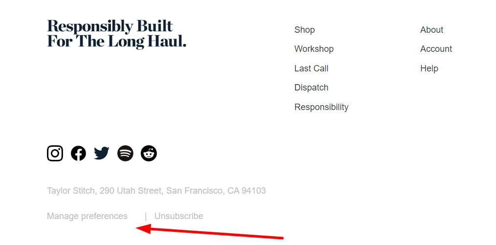
Source: Private Inbox/Taylor Stitch
Also, your customers may have lingering questions about orders, shipping policies, or specific products.
Placing FAQs or links to other resources in your footer can both jog their memory and offer ready-made solutions.
Violet Grey, a luxury beauty product retailer, makes it easy for customers to find help by embedding relevant links in the footer.
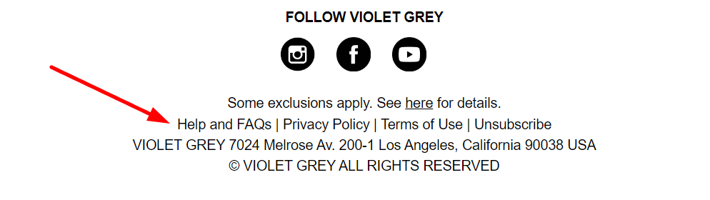
Source: Private Inbox/Violet Grey
Plus, when help is consistently available in the footer, customers will know exactly where to find it the next time they need assistance.
The footer section might not be the most valuable part of your email structure, but it certainly is indispensable.
Also, people who travel all the way down to this last section of your email are likely to be more engaged with your brand.
So why not make the most of it by giving them the means to connect with you even further?
Conclusion
And there you have it—your very own guide to the key elements of every eCommerce email that really hits the mark.
But here is where the fun really begins. It is time to roll up your sleeves and put these email strategies into action.
And who knows, maybe we have sparked off a light bulb in your mind, giving you fresh, exciting ideas that you are just itching to try out in your next email campaign.
Increase Sales Today
No Credit Card Required. Pre-built Strategy.
Most Popular Articles
13 eCommerce Email Marketing Statistics You Need to Know
No doubt, you've poured your blood, sweat, and, let's face it, a fair share of coffee into building your email...

Types of eCommerce Marketing Emails to Drive More Sales
So, you’ve decided to level up your business and use email marketing to boost sales? Excellent! Before you send your...

12 Inspiring eCommerce Email Marketing Examples for Your Next Newsletter
With today's competition in eCommerce, standing out from the crowd is crucial, and email marketing is still a powerful tool...