
General Settings on the Popup Editor / Weblayr Editor
To enter the general settings for designing a popup you must first enter the popup editor.
The general settings are displayed on the editor's left-hand side.
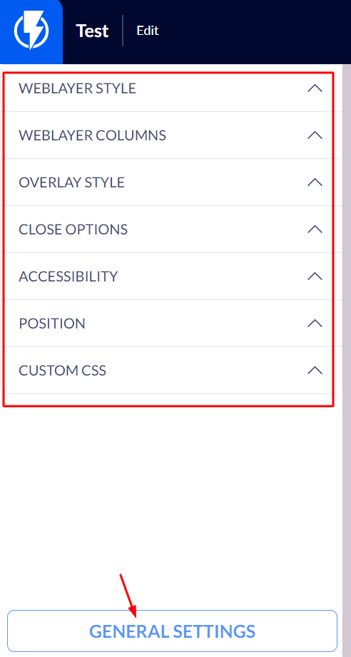
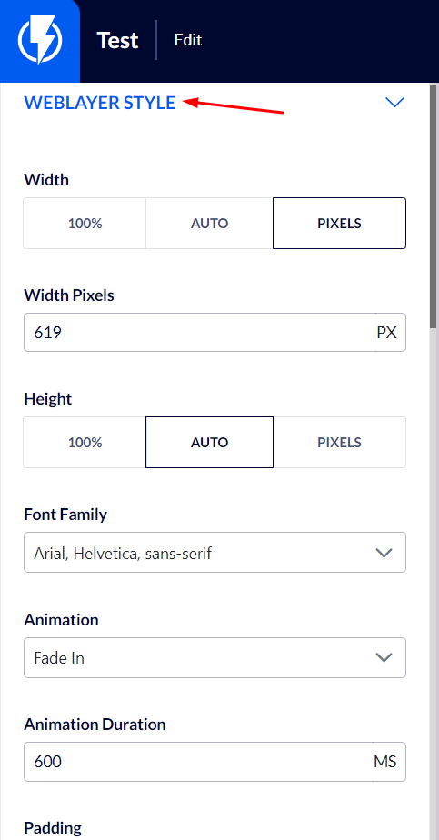
Weblayr Style
Width / height – here you can set the width and the height of the popup, by pixels.
Click here for recommended sizes of popups on computer desktops / mobile screens.
Animation / Animation Duration – you can select the effect accompanying the popup appearance and the speed at which the popup appears.
Padding / margins – you may add spacing / margins on all sides of the popup.
Border Width – you may add a frame around the popup and set its width in pixels.
Border Radius – the popup's corners may be rounded.
Shadow size / shadow color – you may add a shadow effect to one or several sides of the popup (even to all sides) and set the shadow's color.
Background – you can select the background for the entire popup, this background can be transparent*, an image, or of a certain color.
*If you select a transparent background, your website's page will serve as the background.
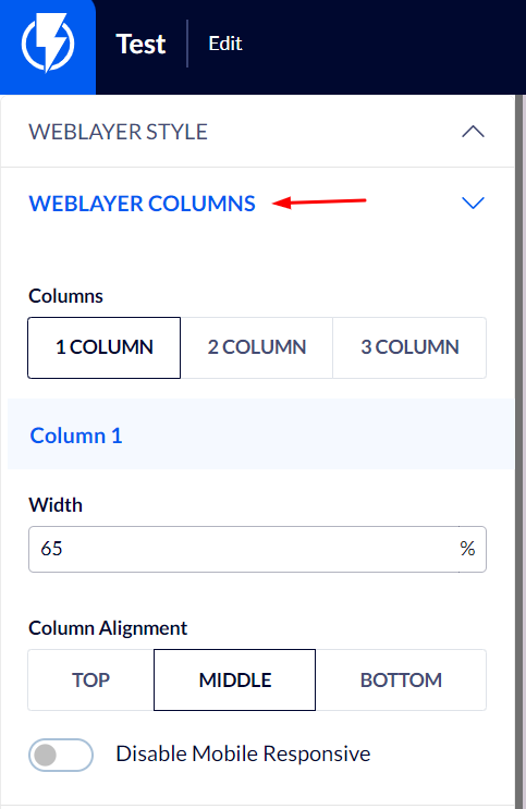
Weblayer Columns
Columns – you can set the desired number of columns for the popup.
Column width – you can divide the width of the popup between the columns.
Column alignment – you can align the columns to a desired direction.
Disable Mobile Responsive – you can cancel responsivity for Mobile to prevent the splitting of columns.
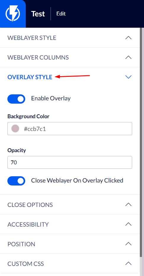
Overlay Style
Adding a background layer – activating this switch will allow you to display a background layer across the whole screen behind the popup when it appears.
Background color / Opacity – you can set the background's color and the percent of its transparency.
Close Weblayer On Overlay Clicked – if you set a background layer, activating this switch is recommended so that your customers may close the popup by clicking its background.
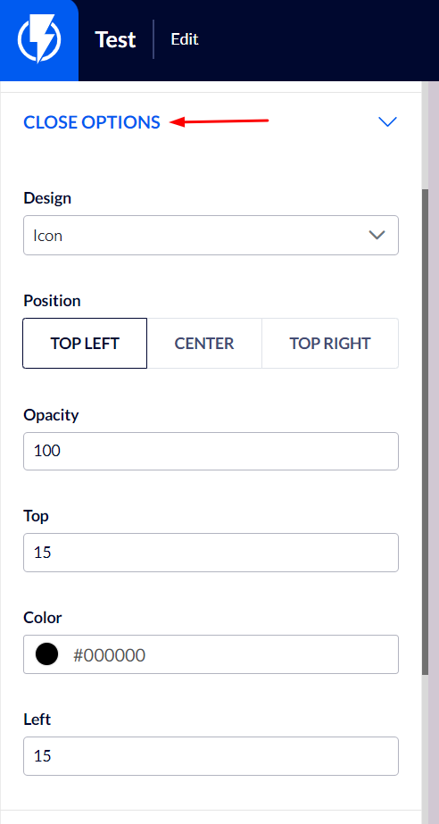
Close Options
Design – you can select the close button's design: an "X" icon / any text you want ("close popup" for instance) / no close button / any image of a close button that you upload to Flashy.
Position – you can select the location of the popup's close button.
Top / Left – these boxes allow you to set the location of the popup's close button more precisely.
Opacity – you can set the transparency percentage of the popup's close button.
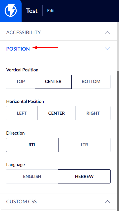
Position
Vertical / horizontal positioning – you can set the popup's position on your website.
Direction / language – if the popup is in Hebrew select "RTL" for direction and "Hebrew" for language. If it's in English select "LTR" for direction and "English" for language.
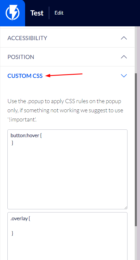
Custom CSS
These settings allow you to elaborate a popup's design or add special effects to it by using CSS.