
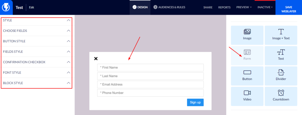
Form Element on the Popup Editor / Weblayr Editor
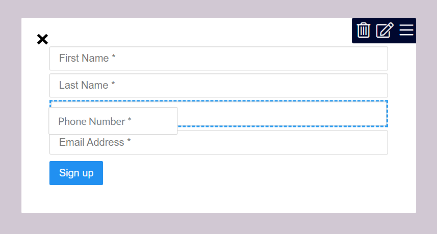
This element will enable you to display a "detail collection" form on a popup.
Drag the "Form" element from the right-hand menu to the desired location on the popup, or click the form element that already exists on the popup.
The element's settings will be displayed on the left-hand menu.
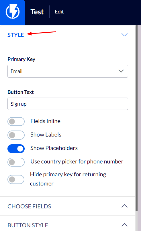
Style
Button text – fill in the desired text for the form's button.
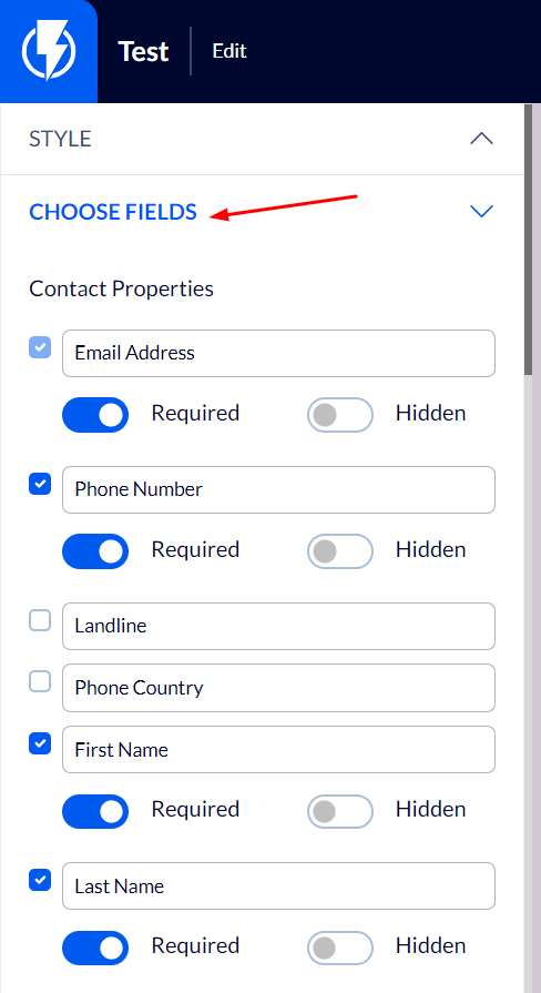
Choose Fields
Under "Contact's details" you can select the fields that will appear on the popup.
- To add a field, check the checkbox beside it.
- For a field to be a required one, activate the "Required" button next to it.
If you wish, you may change the order of the fields by hovering over a field on the form and dragging it to the desired location.
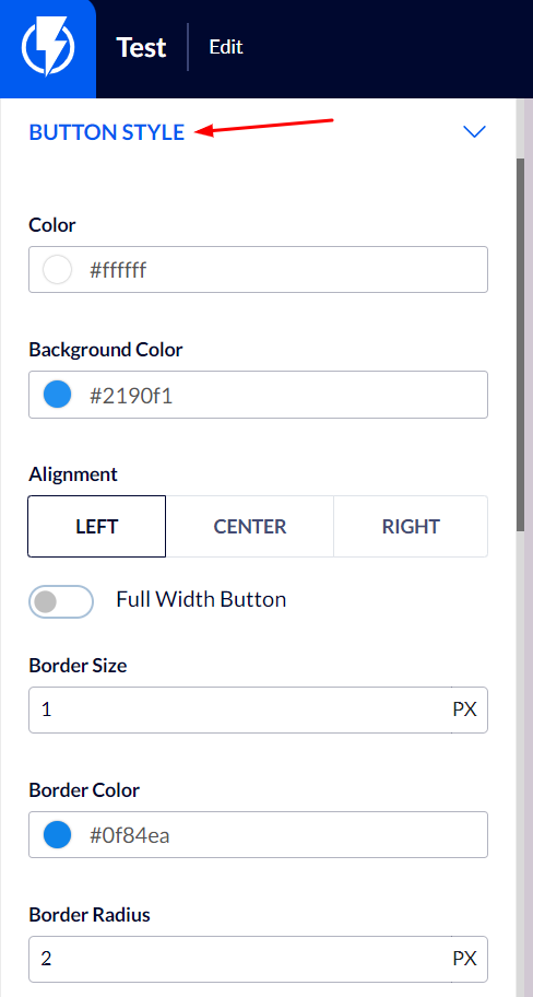
Button Style
Color and background color – you can set colors for the button and its' background.
Alignment – you can select the location of the button on the element.
Full-width button – activating this will define the button as one that stretches the full width of the element.
Border size and color - you can frame the button by setting the frame's desired width and color.
Border Radius – corners may be rounded to varying degrees.
Size – you can select the size of the text on the button. The button's size will be automatically adjusted to fit the size of the text.
Font-weight – you can select the button's text font-weight: light / normal / bold.
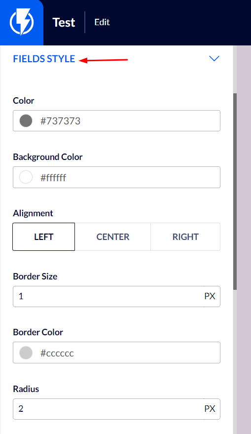
Fields Style
Color and background color – you can set colors for the fields' font and background.
Alignment – you can select the location of the text on the fields.
Border size and color - you can frame the fields by setting the frames' desired width and color.
Border Radius – corners may be rounded to varying degrees.
Size – you can select the size of the text in the fields.
Font-weight – you can select the fields' text font-weight: light / normal / bold.
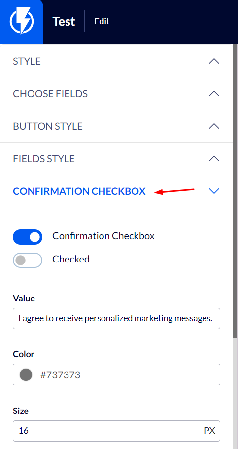
Confirmation Checkbox
Add a check box for receiving communications – to add the check box activate the button "Confirmation Checkbox".
You can select the check box to be already checked, as the default option, by activating the "Checked by default" button.
Value – you can enter the desired text for the agreement box.
Size – you can set the size of the agreement box's text.
Font-weight - you can select the check box's text font-weight: light / normal / bold.
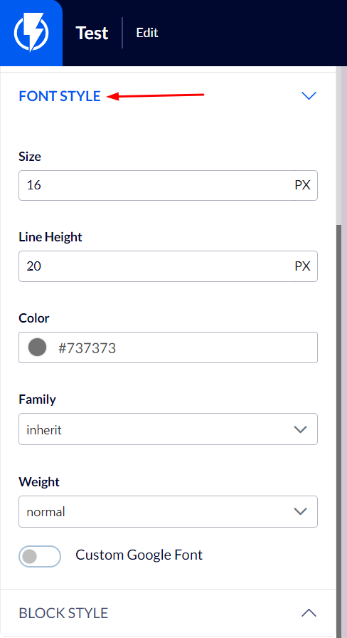
Font Style
Under "Font Style" you can set the font's color, size, weight, etc.
In the "Font" box you may select the type of font from the ones offered by Flashy (if you wish to use a google custom font that is not among the options Flashy offers – you can do so by clicking the "Add Custom Google Font" button and pasting the font's name in the "font" box).
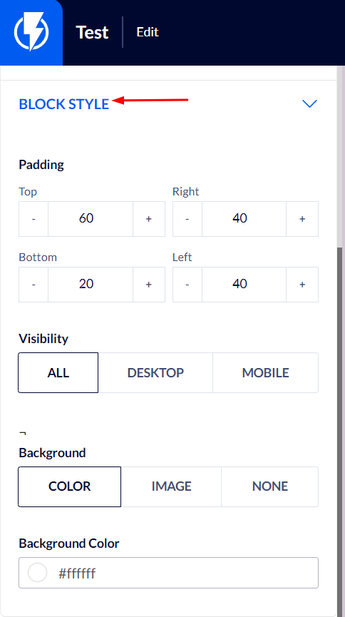
Block Style
Padding – you can set the element's spacing, from all directions, on the popup's template.
Visibility – you can select to display the element on mobile/ desktop/ all.
Background – you can set the element's background to be color/ image/ none.