
Responsiveness of Email Templates
To ensure the best visibility for your emails, both when viewed on computer screens and mobile devices, Flashy sets elements in your email templates to be responsive by default.
A responsive element is a flexible one that automatically adjusts its size and visibility for different devices.
This is why when opening an email on a smartphone, images that appeared next to each other on a computer screen, may now be positioned one under the other, to ensure the best visibility for each image, taking into account the dimensions of the smartphone's screen.
How to Cancel an Element's Responsiveness
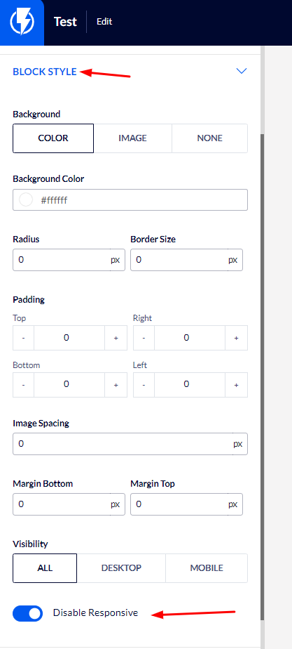
If you wish to cancel an element's responsiveness, hover over the element in the desired template.
In the left-hand menu, among the element's settings, under "BLOCK STYLE", you will find the "Disable Responsive" button, click on it to cancel the element's responsiveness.
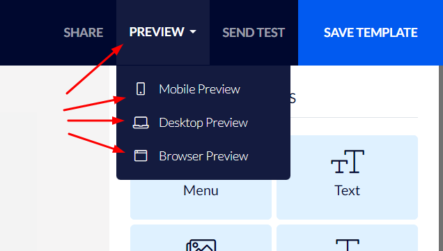
You may use the preview function in the upper right-hand corner to view how the email will appear on different devices.