
Controlling Responsive Elements in Email Templates
Flashy wants to help you make your emails look their best, whether they’re being viewed on desktop or mobile devices. This article explains how to choose to make your email elements responsive on mobile devices or set them as unresponsive to match the desktop version.
Responsive vs. Unresponsive
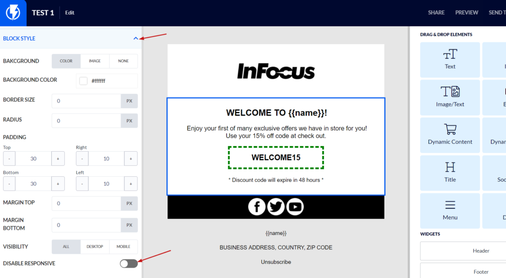
To follow along, go to Templates in your Flashy dashboard at the top of your screen, and open up one of your templates. In the left-hand menu at the bottom, there is a “Disable Responsive” toggle. When this toggle is switched off, your elements will be responsive in the mobile version. This means, for example, that if you have several elements in the same row, such as two or three images side by side, they will be broken down to one per row in order to be more mobile friendly.
When the toggle is switched on, elements will be unresponsive, and the mobile version will look the same as the desktop one. You can click on Preview in the upper right-hand corner and select Mobile Preview to see what each option looks like.
Your Emails, Ready for Any Device
This responsive element option is available on each non-text element in your template. Use this simple action to decide exactly what your customers will see when they open up your emails. Optimization has never been easier!
